Table of Contents:
- Choose a Professional
- Understand Your Specific Brand
- Consider Your Competition Before You Start
- Should Your Logo Be Text, Images, or Both?
- Brainstorming Images
- Choose or Create Your Font
- Selecting a Color for Your Roofing Business Logo
- The Color Wheel
- Roofing Logo Design Practicalities
- Getting Second Opinions on Your Logo
- Trust Your Intuition
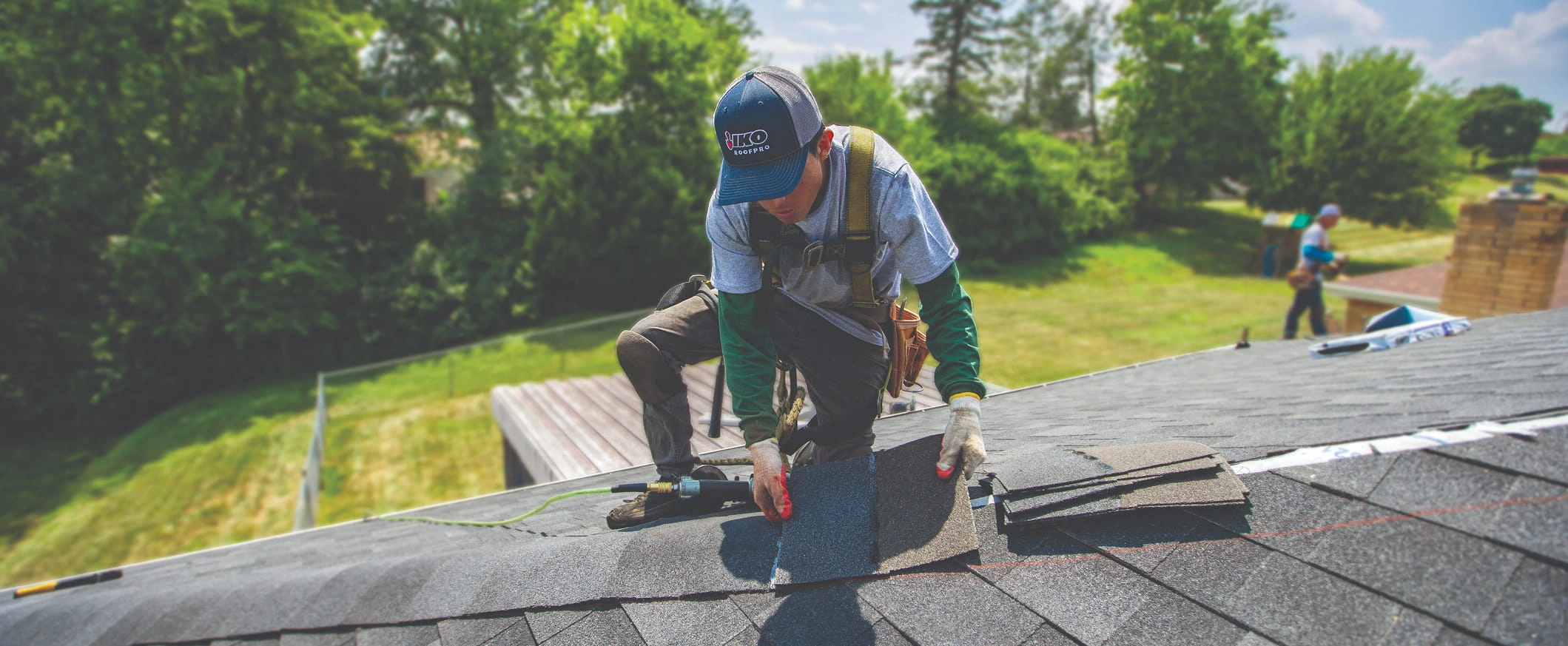
One of the most exciting parts of starting a roofing company, or giving it a brand refresh, is designing your logo. It’s thrilling to see your vision for a company translated into art. A clear, expressive, and strong logo that stands out can be a significant asset for your business moving forward. It can attract and convert customers and cement your brand’s identity. Getting the right design the first time is important, as you’ll be putting precious marketing dollars into the logo. Changing your roofing company logo later can undermine your attempts to become a prominent and recognizable roofing company in your service area. So, it’s wise to get a design you’ll be happy with the first time.
From practicalities like deciding who to hire to fun decisions like your logo colors, there are plenty of decisions to make to design a roofing business logo. Here is everything you need to know to get a logo you’ll be happy to put on the side of your truck or elsewhere.
Choose a Professional
Unless you have some graphic design talent, you will likely need to partner with a logo design professional to create the right logo design for you. While looking for a free roofing company logo design may save you money at first, it may hamper your business in the long run. People might judge your business based on your logo, and if it is poorly designed, they may not think highly of your company.
Further, it’s not the best idea to settle for a free contractor logo now and pay for a better one later. Once you’ve begun to build brand recognition, it’ll be harder to change your logo. You may lose some name recognition, and it will be expensive to re‐brand your marketing materials, from your business cards to your t-shirts. It’ll save you money and time in the long run if you choose your logo right from the outset.
You have a few choices when it comes to working with a logo designer. Many creative agencies offer logo design. Some are marketing agencies that will help you develop your whole brand along with your logo, starting with a strategy to help you define your target audience, and how your brand can appeal to them. Although, these services do come at a cost.
If you need to cut costs but still want a quality logo, one option is to work with a freelance graphic designer who has experience designing logos for businesses of all types. You’ll get their artistic ability and their translation of your brand message, but they will rely on you to explain what message you need the logo to communicate and which design elements should be present.
Whether you choose an agency or a freelance logo designer, be sure that they will be willing to make multiple iterations and a few edits. You likely won’t be happy with their first attempt, and you want to work with someone who genuinely wants you to achieve your goals for your logo and create a strong asset for your company.
Understand Your Specific Brand
All great logos need to reflect the company that they represent. When someone sees your logo, they should understand what your business does, have a basic impression of your brand qualities, and perhaps even begin to make an emotional connection with your company. To make your logo or help your designer make the best logo for you, you need to have a clear understanding of what the roofing companylogo should represent and communicate that to your designer.
Before you look online at competitors for inspiration, it is a good idea to focus on the unique identity of your business. That way, you’re not influenced by how other people have presented their brand. You’re more likely to come up with something that fits your needs instead of something that looks interesting but doesn’t say much about your company.
To start, think about the basics of your company. You’re a roofer, so the logo should communicate that. Are there other services or specialties that your logo should also communicate? You might want the logo to suggest that you’re a commercial or residential roofer. You might also want it to communicate that you offer gutter cleaning or siding services. On the other hand, your other services may not be so critical that they need to be in the logo. If your other services are strong differentiators from your competition, they are more likely to be worth including.
Next, you may want to generate a list of characteristics that you’d like people to associate with your brand. You can make a shortlist of the three or so most important things people should think of when they think of your brand. Or, you may have a more complex brand that needs more explanation to your designer.
Here are some traits that roofing companies may benefit from being associated with:
- High-quality
- Reliable
- Affordable
- Traditional
- Honest
- Detail-oriented
- Integrity
- Environmentally conscious
- Family-oriented
- Community-oriented
- Friendly
- Cutting-edge
- Down-to-Earth
- Wholesome
- Sophisticated
- Dedicated
- Skilled
- Experienced
- Precise
If you don’t see your ideal characteristics on the list, that’s likely a good thing. Having unique associations can help you stand out from other roofing companies.
Consider Your Competition Before You Start
Now that you have some idea of how you’d like to define your brand, it’s a good idea to check how your competition has branded themselves. Look at different roofing company logos in your service area or just outside of it in case you expand in the future. Are there similar themes, colors, or objects? It is wise to avoid following those trends or choosing any elements or design features that look too much like the competition. Otherwise, it is harder to stand out and make your mark in a market in which they already have a presence.
That’s not to say that just because several companies in your area have a roof in their logo, that you can’t also have one. Your designer can choose a unique style, shape, color and text for your logo to help it stand out even if it shares this common element. In fact, they may want to use local architecture to inspire a different take on your roof. Having your logo match common roof styles in the area will make it more recognizable and appealing.
Should Your Logo Be Text, Images, or Both?
Some logos are only the brand name, stylized, like Google. Others are only an image, with no words, such as Twitter. You can choose either or design a roofing logo that combines your brand name, tagline, and image. Most graphic designers will supply various variations of a logo for different purposes. They may offer versions with only text or only graphics, vertical and horizontal versions, and logos that include your slogan. Most offer badge versions that are standalone icons. Plus, there are other more niche options they may include, such as:
- Color variations: They may also offer full-color, inverse, black and white versions of the logo.
- Backgrounds: Your logo may have a white background or a color background. If it has color, you may need alternative versions with different colors to suit different purposes.
- Styles: If your logo is complex, it may be beneficial to have a more minimalist or trimmed-down style. Brandmarks, which represent your brand without words, and lettermarks, which are more like your brand’s initials, are both great options if you need a simpler logo.
- Orientation: You may need a vertical or horizontal version of your logo.
- Frames: Many brands include a framed version of their logo.
These different logos can be used in different circumstances, such as on social media, on a pen, or a uniform. Be sure to discuss what versions of your roofing company logo the designer will create before you agree to work with them.
Brainstorming Images
If you’d like your logo to include an image, which should you choose? It should have some logical connection to your business name or what you do. Roofing tools such as hammers and nails are a logical choice. Even if you prefer to use nail guns when actually roofing, people have strong associations between a hammer and roofing. Your roofing business name might also suggest an ideal image. Fox Roofing could use a fox, Starr Construction could use a star, etc.
It is common to choose arrows, clocks, or other symbols denoting time to indicate that you arrive quickly for emergency work. Alternatively, you could choose an animal that represents your brand’s qualities. A roofing company that wants to be known for arriving quickly to roofing emergencies could choose a rabbit or cheetah.
Roofers also very commonly choose images of homes and residential roofs. However, it is wise to keep in mind that a residential-themed logo may make it harder for you to expand into doing commercial work down the road.
Here are three examples of real-life roofing company logos that use some of these design strategies:
Lane Roofing
![]()
Roofshield
![]()
Creative Home Solutions
![]()
Let’s say that you want to send a different message. Your services aren’t about speed or emergency response, but about offering the best quality warranty or great quality roofing. Quality roofing company logos could use symbols of protection, such as shields or castles. Or they could choose symbols that denote quality, such as stars or check‐marks. They may also use colors that reflect quality, such as gold and silver.
Real-life roofing companies whose logo design makes this kind of impression include:
Omni Exteriors
![]()
Covelli Roofing & Construction
![]()
Cen-Tex Roof Systems
![]()
Any roofing company can offer both quality roofing products and speedy service. Similarly, your logo can be complex and express multiple aspects of your business. However, by focusing on fewer aspects, you may end up with a clearer logo that is more easily understood by your customers. Complex logos are tough to get right, but they can be done.
Choose or Create Your Font
Which font should you choose to represent your brand? Look beyond the common typefaces you can find on your word processor. Choosing one of those common typefaces will make it harder for your brand to stand out, as people are already familiar with these fonts. Instead, you can search for more unique fonts online and pay to use it for your brand. Several websites sell typography. You may also be able to purchase pre-made fonts from the artists directly.
While it is typically more cost-effective to buy a font the artist has already designed, you can also ask the artist to design something specifically for your brand. While this is an expensive route, it can go a long way to defining your brand visually and making your logo more unique.
Before you buy a font or work with a professional to create one for your logo, it’s best to get a quick idea of what you might be looking for. There are several different major kinds of typefaces, or families of related fonts. Each font has a different look and feel that will bring different associations to your brand.
Serif: Serif fronts are those with small lines at the ends of letters that help them create contrast. They are typically thought of as easier to read. While many, including Old Style and Transitional serif fonts, add a traditional, reliable character to your brand, others are more modern such as Neoclassical and Didone serifs. Slab serifs look like a cross between sans serif and serif fonts. They look consistent in weight, like sans serifs, but have serif flourishes. There are also Claredon and Glyphic serifs for you to explore.
Sans serif: Some of the most popular modern fonts, such as Helvetica, are sans serif fonts. They don’t have the flourishes of serif fonts, and their lines look more even and consistent, with few spots thicker than others. Grotesque sans serifs, such as Helvetica, they have many right angles and therefore look square or boxed. Square sans serifs may have even more right angles. Geometric sans serifs may look elongated or rounded in comparison to the squarer fonts. Because they look stretched, Geometric sans serifs tend to be less readable. While most sans serif types are consistent in line thickness, Humanistic sans serifs are an exception. These have high contrast in the thickness of their lines and are easier to read as compared to other sans serif types for that reason.
![]()
Script type: Like handwriting, script styles flow from one letter to another. Formal scripts, Calligraphic scripts, Blackletter and Lombardic scripts are all examples of script types. Most have an old feel to them, but Casual scripts look more modern.
![]()
Decorative: These scripts are highly varied and use unorthodox shapes, accents and decorative flourishes. They are often built around a theme, whether that’s a specific culture, holiday, or style.
![]()
Selecting a Color for Your Roofing Business Logo
Color is an important consideration for any logo. While you can make your logo black and white, adding color can help it stand out and can help it bring more associations into the viewer’s mind. According to Foundr, about 95% of brands use two colors in their logo. Likely, you’ll also end up choosing two colors for your roofing company logo.
Each color represents different emotions and brings up different associations. How might a roofing company leverage each color?
Red: According to Foundr, roughly 29% of the world’s major brands have some red in their logo. This makes it the most popular color outside of blue. Red may be so popular because it’s a vibrant color that more easily stands out from the rest. For roofers, red makes sense as a color to stand out, add urgency, and even highlight your emergency roof repairs service if you offer it.
![]()
![]()
Yellow: Yellow is yet another bright color that you can put to good use as part of a roofing logo. Yellow has few strong associations, as everything from luxury brands to cheap brands use it. It adds brightness and positivity to a logo.
![]()
Green: Green may be a great color for your roofing company. It can represent relaxation, peace, and the environment. If you offer sustainable options like cool color shingles, or just want to highlight your company’s sustainable practices, green is a particularly good color to pick.
Blue: Among major brands, blue is the most popular logo color. That may be because it is associated with a wide range of positive characteristics, including confidence, calming, logic, security and more. Blue is a solid choice for a roofing company.
Purple: Purple is a rare color among roofing company logos. That can be a good thing, as using it can help you stand out. However, it may also be rare because its associations don’t typically work for a roofing company. Purple can feel royal, luxurious, mysterious, or spiritual.
Pink: Pink is often associated with feminine traits, which might explain why it doesn’t often feature in roofing company logos. There are women roofers, but the industry as a whole doesn’t try to appeal to women more than men. Still, you might find that pink is the right shade to help you stand out from other roofers in your area or the right shade to reflect your business.
Brown: While brown is not a very common logo color overall, it appears to be more popular among roofers. That may be because roofs are often brown, as are hammer handles, and both make strong logo images for roofing companies. Brown also feels earthy and practical, but your designer will have to take care to ensure it isn’t bland in your logo.
Grey: Grey is a great neutral addition to a logo. It is very grounded, bringing associations of stability, professionalism, and more. However, it can also be plain if used exclusively.
Black: Black is a natural choice for a logo. Many logos are just black, and you may end up representing your logo in all-black in some contexts. Black feels serious, authoritative and strong. As a downside, it can represent death, but that isn’t so much a worry in roofing as compared to other industries, such as medicine.
The Color Wheel
There is a lot of theory about how to combine colors in logos and other marketing materials. The most basic concept is the color wheel. It represents the relationships between the colors.
In the basic version of this theory, colors have two characteristics. A color is either a primary or secondary color, and either a warm or cool color. Colors that look best paired together are across from each other on the wheel.

Therefore, yellow and purple, green and red, and orange and blue look best together. These pairings combine a primary and secondary color, one that is a warm color and one that is a cool color. For example, yellow is a warm primary color and its complement, purple, is a cool secondary color. This high degree of contrast can help a logo stand out.
Some of the world’s most iconic brands use complementary color pairings. For example, Hallmark uses yellow and purple for their logo. However, there are plenty of other options that might work better for your brand. Brands have used only primary colors, or only cold colors and their logos still make an impact. Your designer can help you explore more complicated color theory concepts and find a color palette that will express your brand.
Keep in mind that while color choice is important, it is also wise to have a logo that will still look distinct in a single color. That’s because you may want to use it in contexts where it’s ideal to have the logo in a single color such as when you’re screen printing it or when placing it over your photography.
Roofing Logo Design Practicalities
One of the reasons to work with an experienced professional to design your roofing business logo is that they already know the kind of practical design considerations that any logo needs to be functional for a modern business. If you’re designing it on your own, you will want to be sure that you take these practicalities into consideration:
- Vector images: A designer should make you a vector image of your logo, and not just a jpeg or other image file type. A vector file can be scaled smaller or larger without losing quality. This allows you to use it on the largest signs to the smallest keychains.
- Online use: If you plan on having a social media following, a Google My Business listing, or other online directory you will need a logo that can work as a thumbnail on those sites.
- Medium versatility: You might also want to add your logo to a uniform, banner, pens, and other marketing items. You should have a logo that will work with each different medium. Or have a version of your logo that can work with each.
- Readability: Even when small, your logo needs to be readable. Some companies drop their tagline from the smallest version of their logo.
- Motion: A designer might also consider how your logo can be animated if you choose to use it in videos. You don’t necessarily need to have it animated right away if you won’t be pursuing this for some time.
Getting Second Opinions on Your Logo
Before you finalize your logo, it is important to run it by other professionals to see what they think of it. Mostly, you’re looking for hidden meanings or associations that you didn’t mean to imply with the logo. You can run your logo by a wide selection of your friends. Ask them a few questions:
- What impression does the logo give off?
- What does the logo make you feel about my business?
- Does the color combination work?
- Is it hard to read?
An outside perspective might reveal a big flaw with your logo, and it is much better to find that flaw before you’ve put the logo on all of your marketing materials.
Trust Your Intuition
In the end, trust your judgment about which logo design is best for your business. These roofing company logo design tips are that, only tips. There are no real rules when it comes to logo design, other than that the logo needs to reflect the business it represents to help you get roofing leads. You know that business best of all, so if you feel a logo isn’t right for your company, start again. Your logo will be the face of your new roofing business for years to come, so it has to be perfect.